Marriage by Design
I led the full print suite for my sister and brother-in-law’s wedding, developing a visual system that carried seamlessly from the first impression to the final detail of the day.
Set within a Tuscan-inspired venue, the celebration called for warmth, color, and texture, which resulted in a visual language that felt joyful, romantic, and organic.
Concept & Inspiration
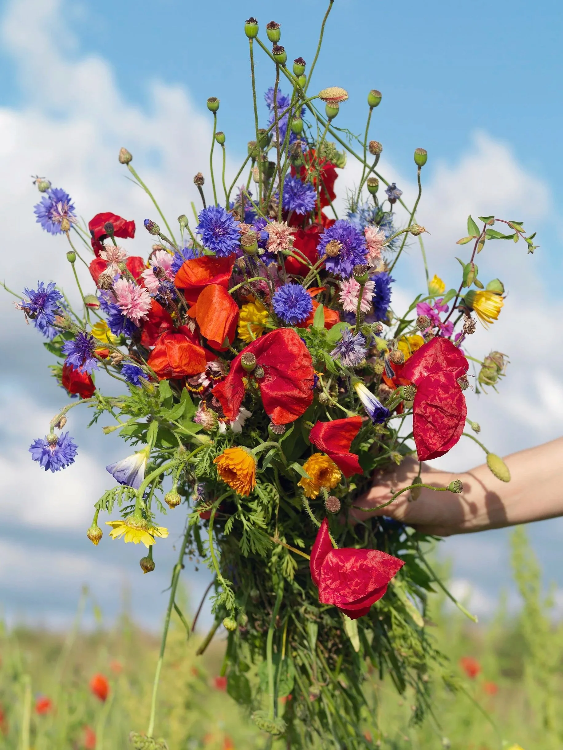
Inspired by the charm of Italy in spring, the palette draws from wildflower blooms and sun-washed color. Every element was selected to feel layered and tactile, creating a sense of craft and care throughout the suite.
The moodboard to the right shows the inspiration for using multiple paper types, colorful envelopes, and script fonts to achieve that effect.


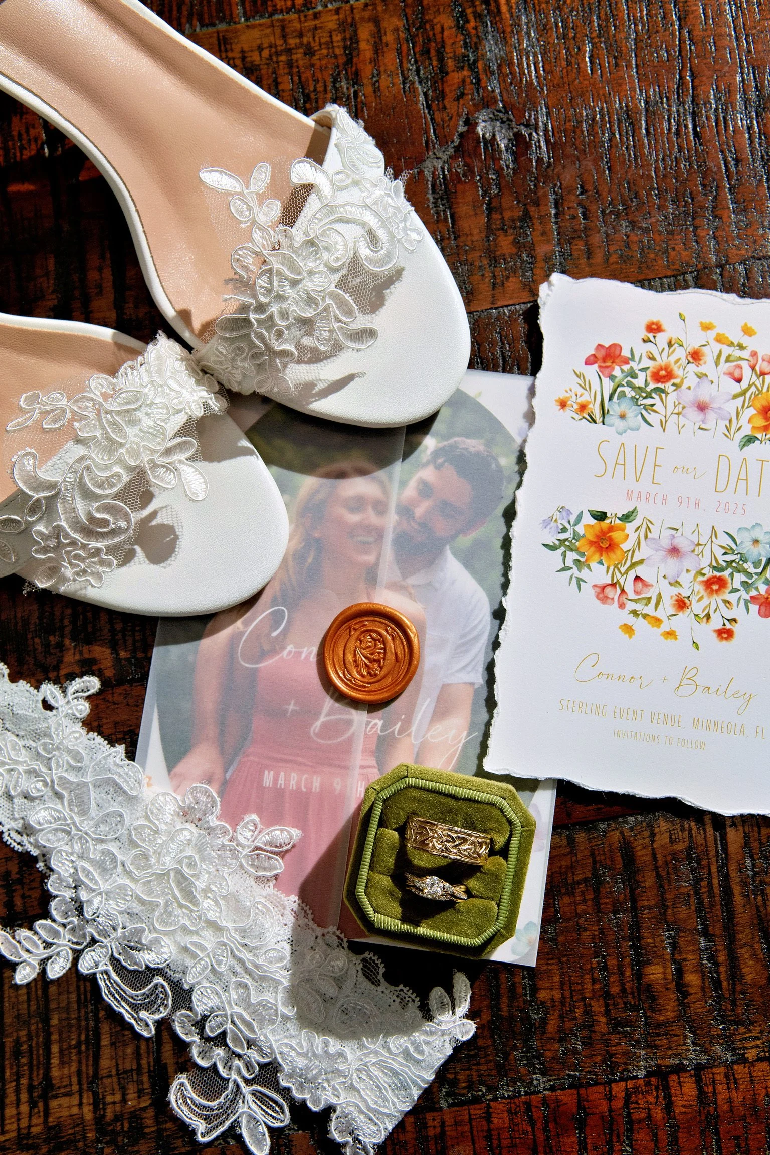
Save the Dates & Invitations
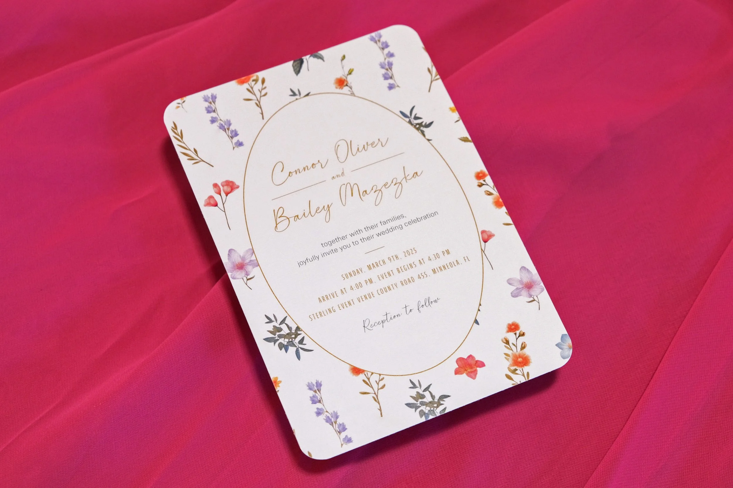
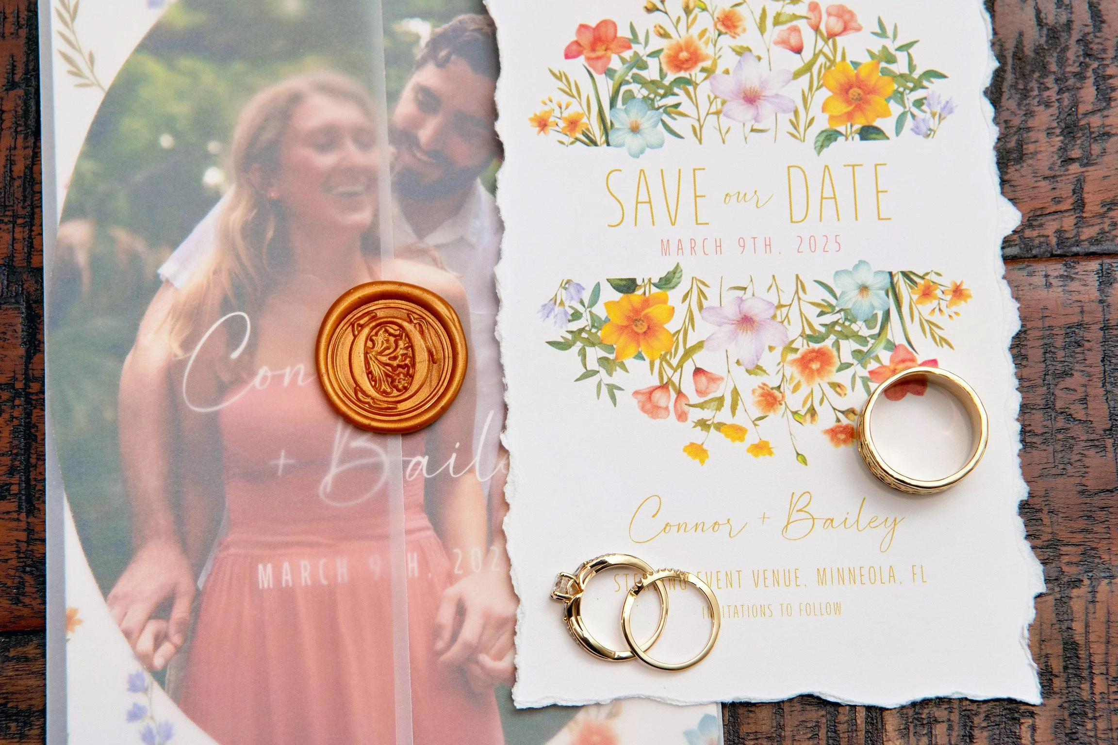
Save-the-dates are printed on matte cardstock with hand-torn edges, creating an organic, softly frayed feel. The invitation suite features two layers of linen paper, hand-cut and wrapped in a translucent vellum jacket.
The top layer is an oval photo from their engagement shoot, accompanied by a thin, expressive script. Beneath it, a rounded-edge rectangle carries the event details. A custom wax “O” seal marks the suite with a personal, lasting detail.
These pieces do more than inform — they invite.


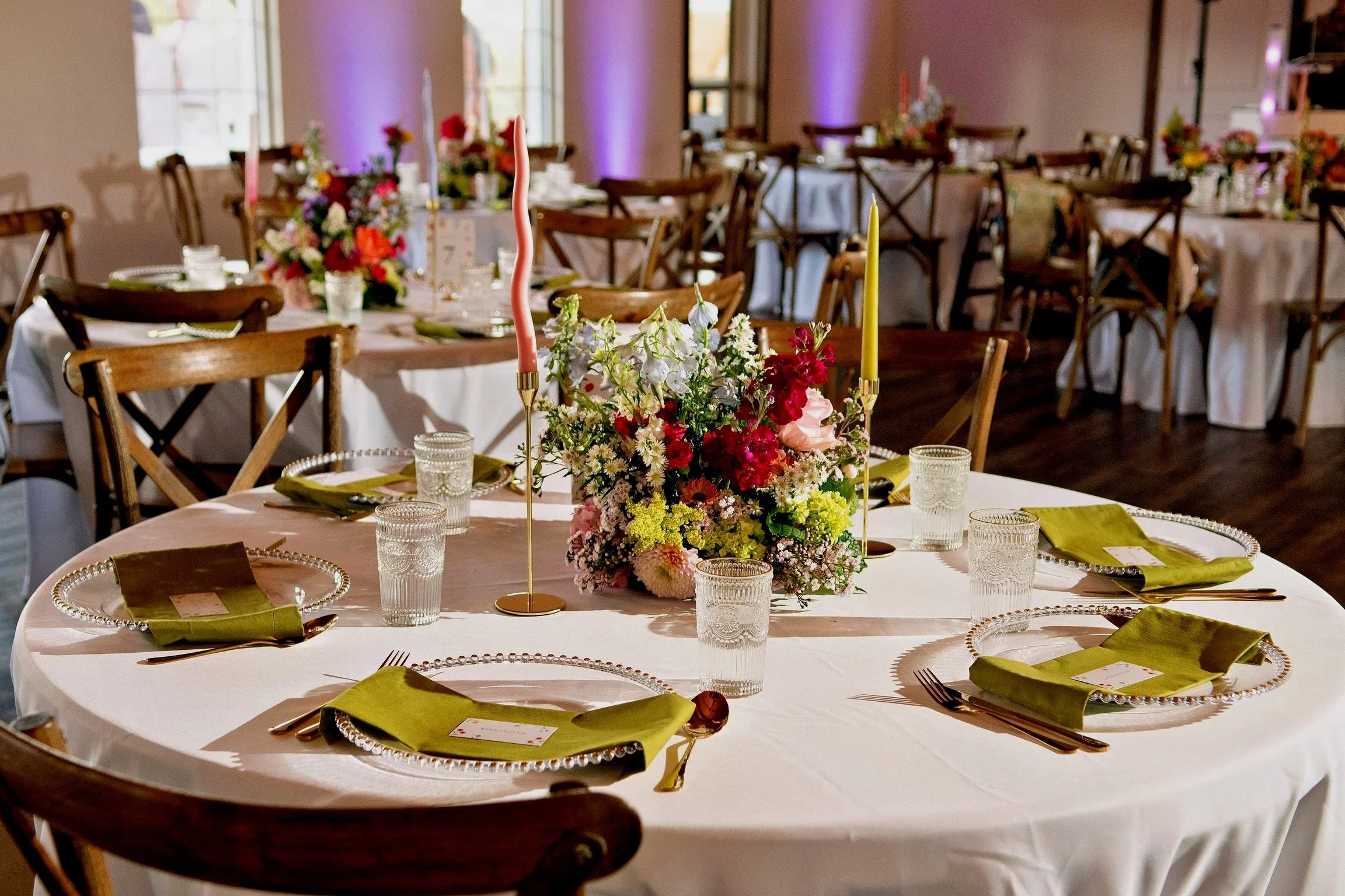
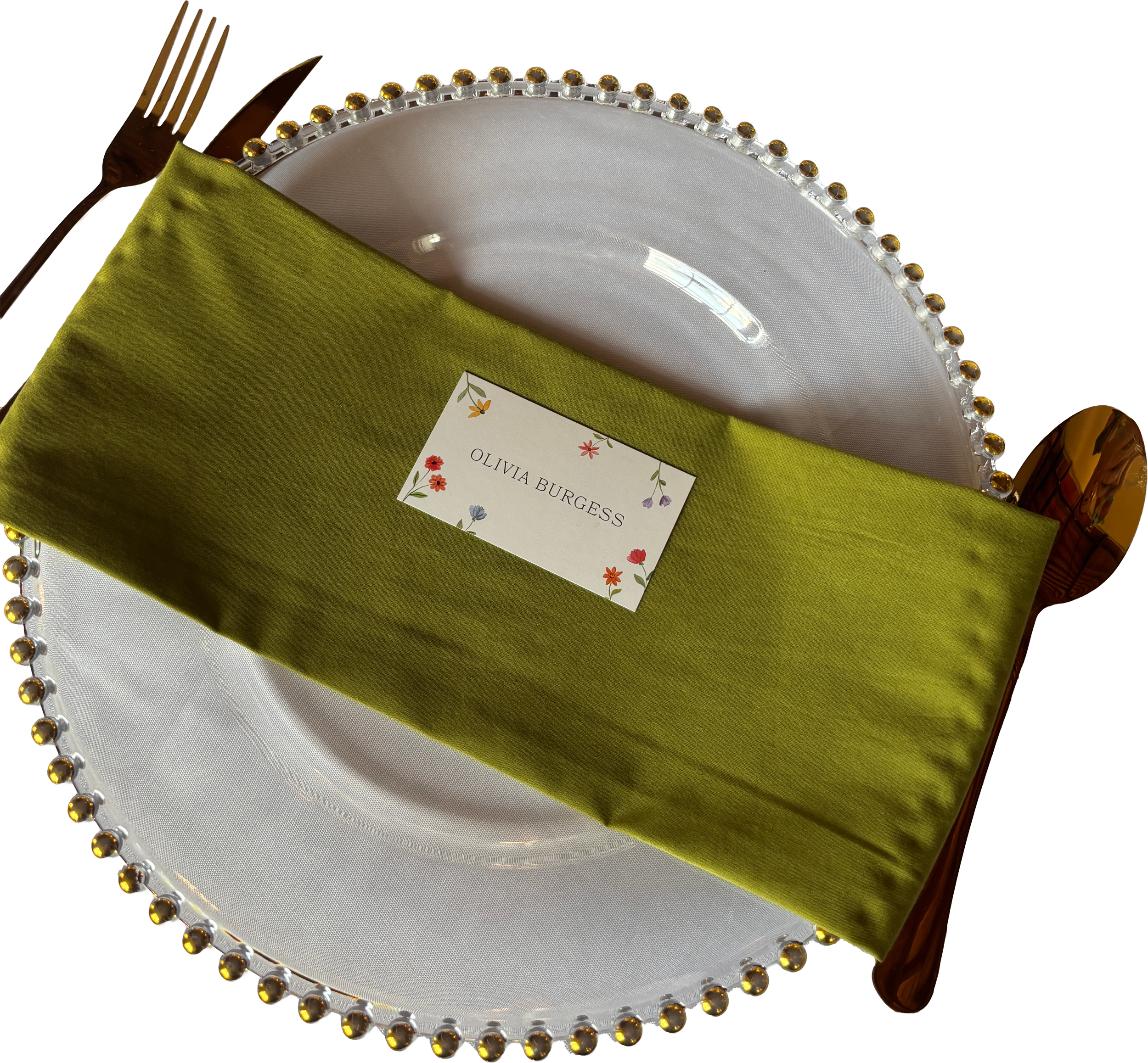
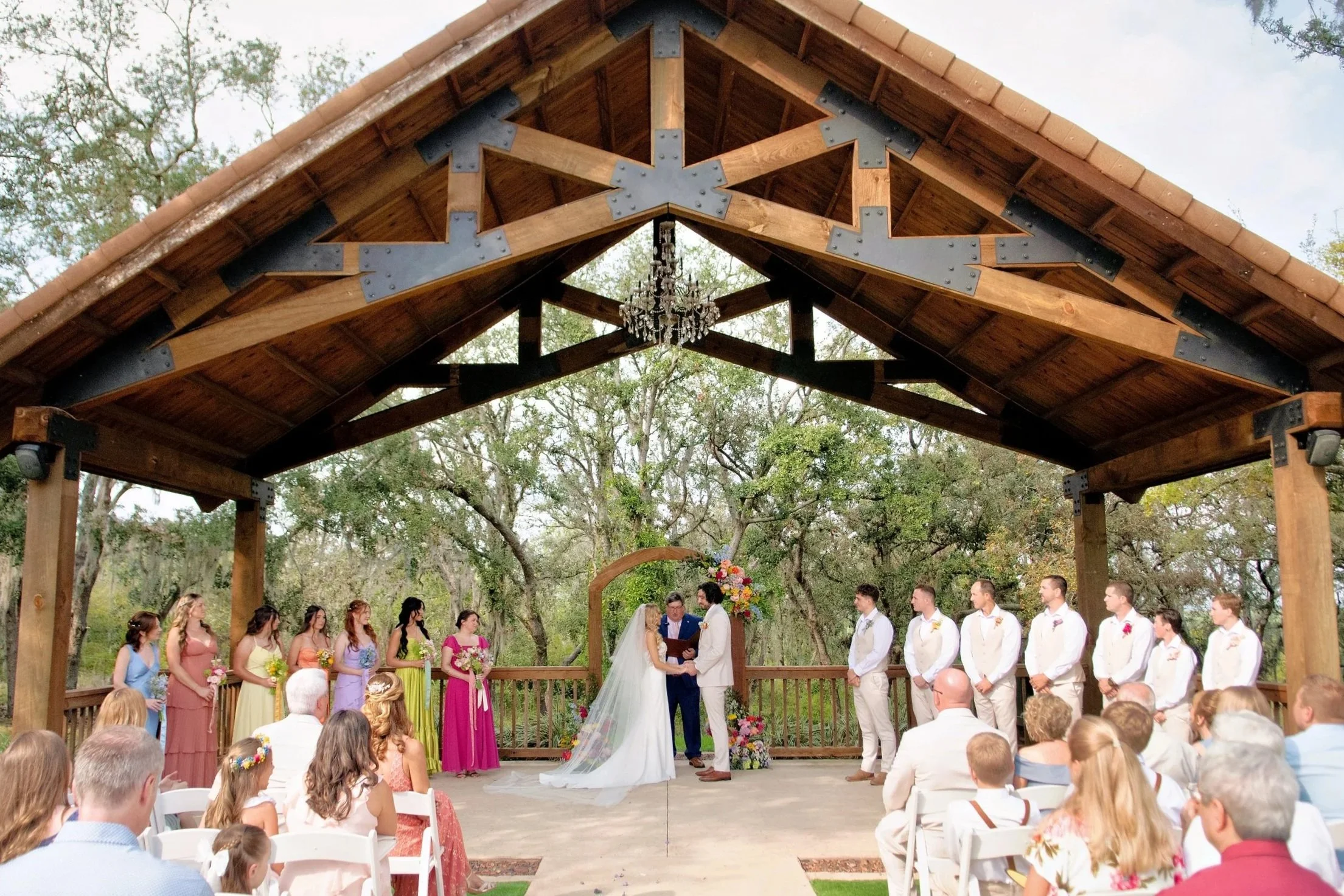
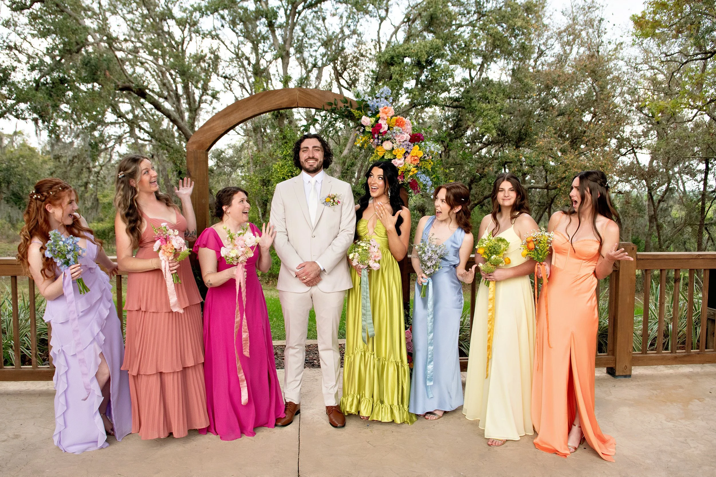
Designs for the Big Day
On the wedding day, the system extends into wayfinding, table numbers, seating, and informational signage. Consistent typography, floral accents, and restrained color ensure clarity while maintaining continuity.
The result is a cohesive environment where every detail feels considered, and every piece contributes to the experience.