
Cleanflight SolutionsInnovation Meets Elevation
Branding and identity for CleanFlight Solutions that establish a modern, professional presence through logo design, visual systems, and marketing materials for its drone-powered cleaning services.
Timeline
Project Type
2025
Brand Design
Logo and Style Guide
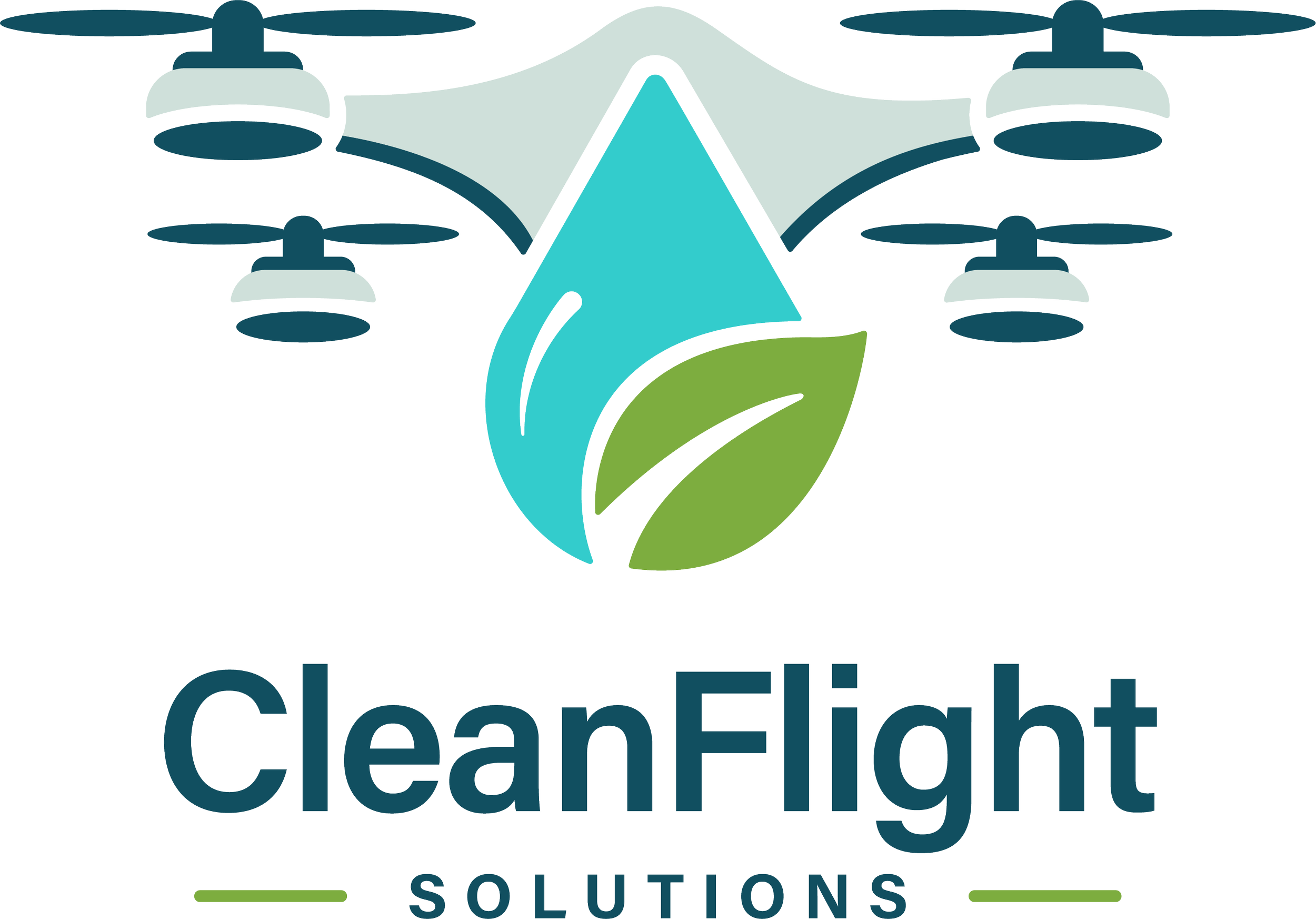
The logo system was designed to be versatile, scalable, and easily recognizable across a wide range of uses. Primary vertical and horizontal logos establish the core identity, while alternate versions, including wordmark-only, icon-only, grayscale, and solid white, allow the brand to adapt seamlessly to different contexts without sacrificing consistency.
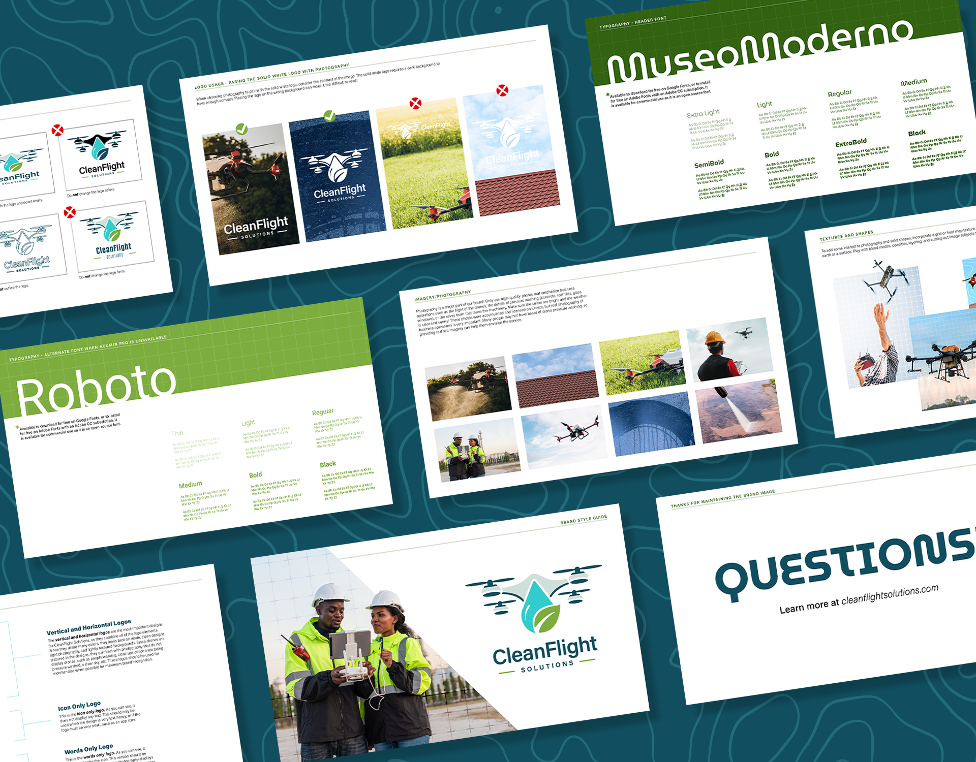
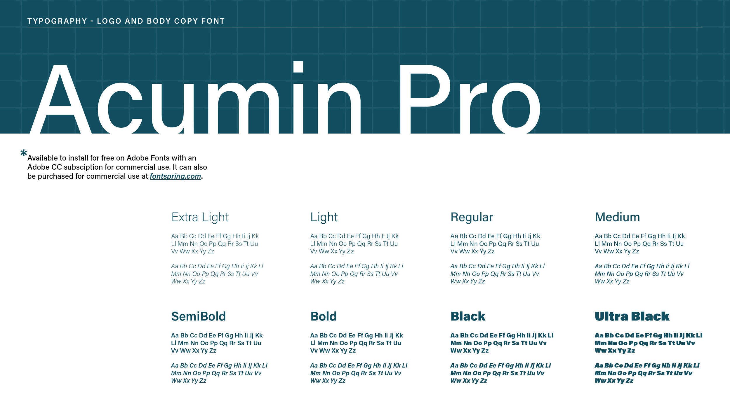
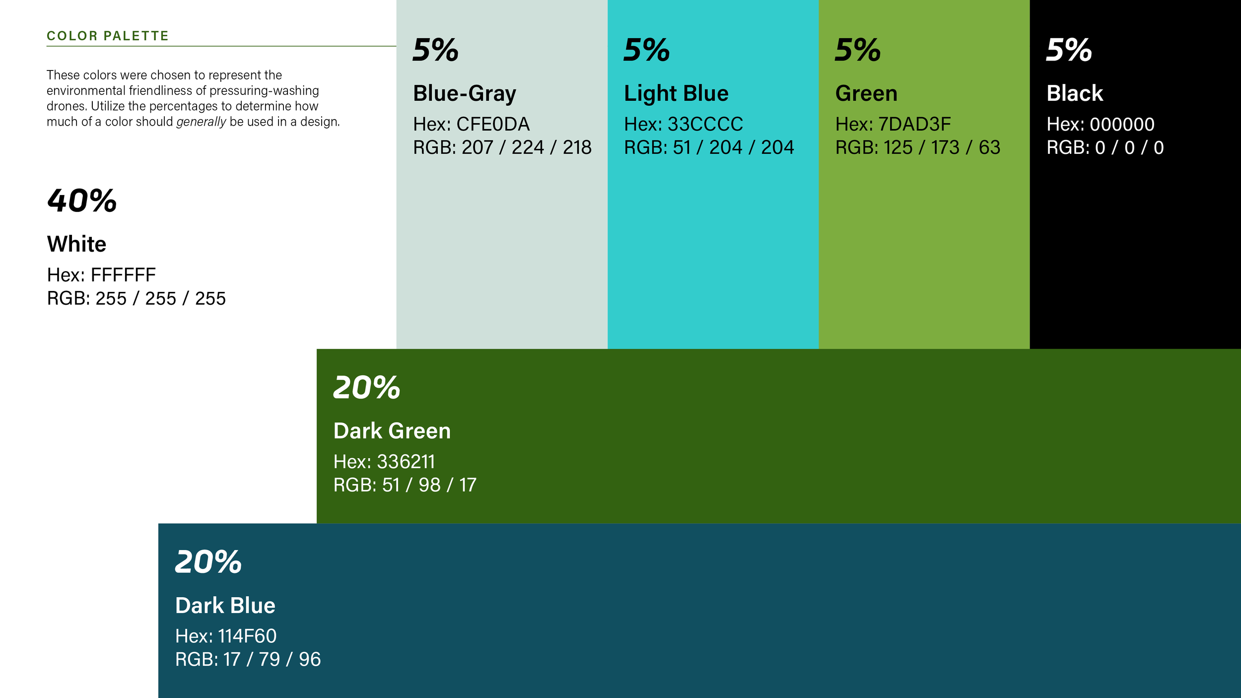
Typography and Colors
Modern, clean typefaces establish hierarchy and legibility, while a nature-inspired color system reflects the brand’s environmental focus and technological innovation.


Images and Textures
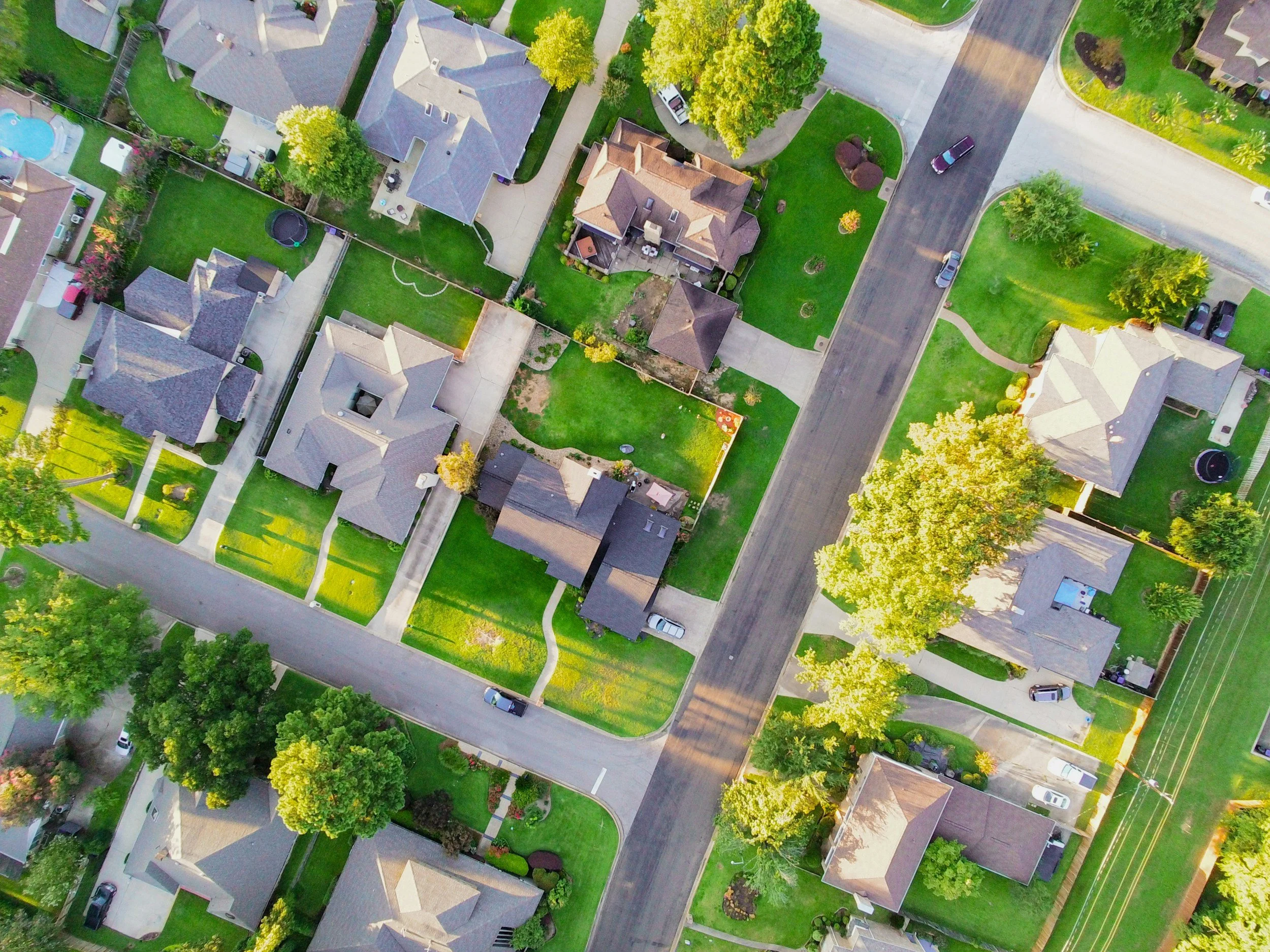
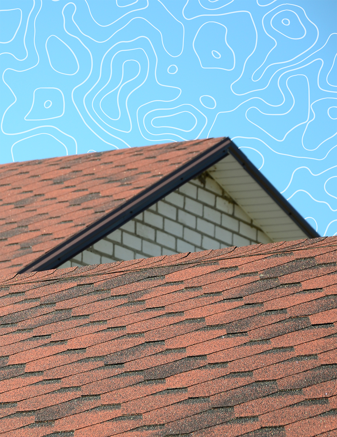
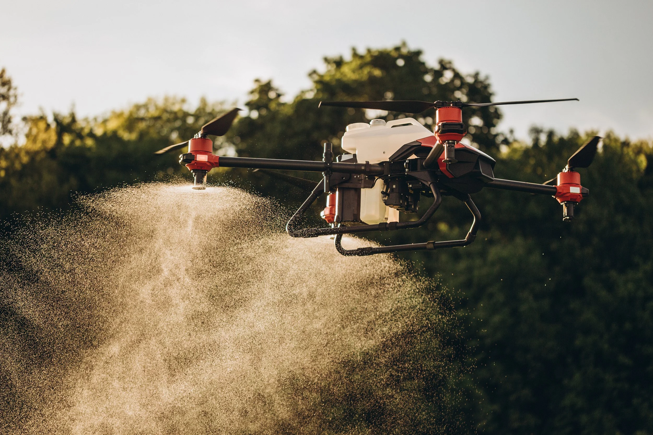
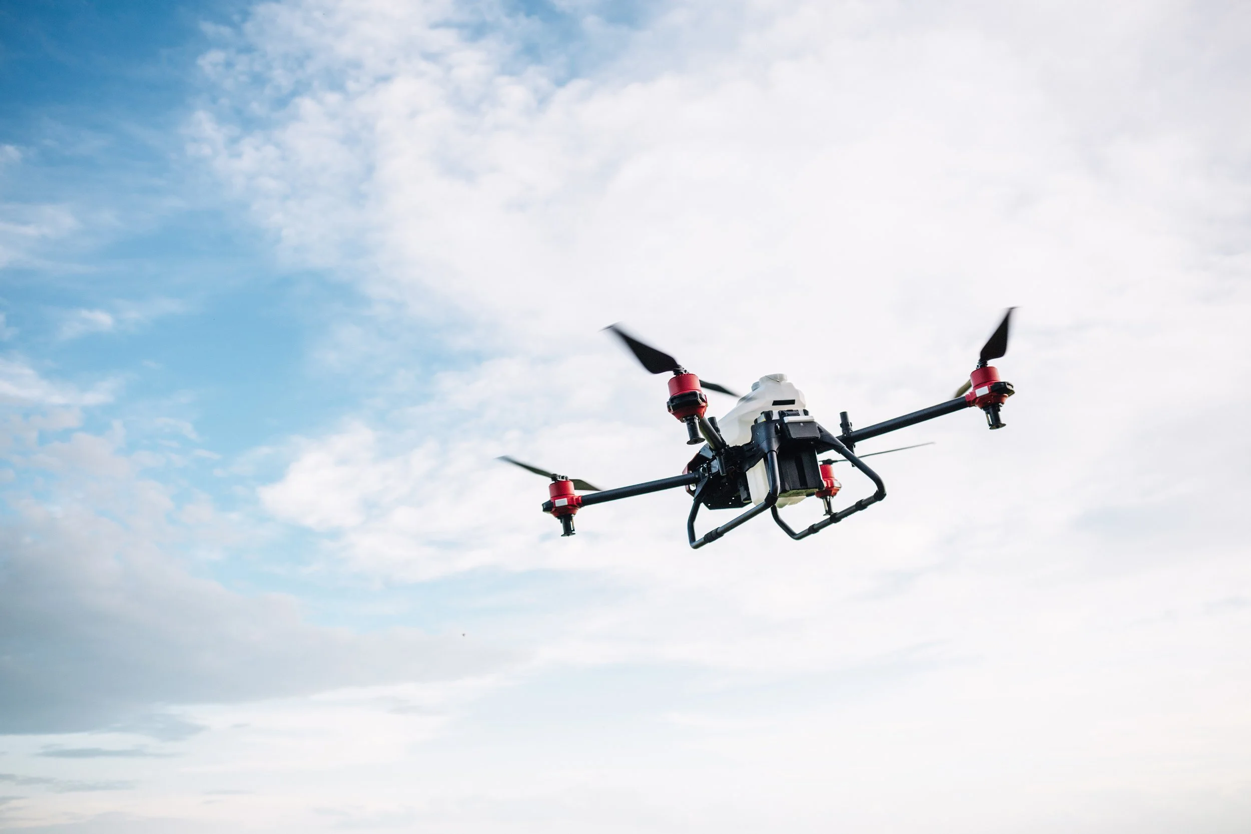
Photography plays a key role in the visual system, emphasizing real-world operations, aerial perspectives, and outdoor environments. Subtle grid and heat-map inspired textures were introduced to add depth and visual interest, loosely referencing mapping systems and drone technology without overpowering the content.


Brand Applications
A series of brand application mockups were created to demonstrate how the CleanFlight Solutions identity can be used across merchandise, print, and digital platforms. These include examples such as staff apparel, business cards, and social media graphics, showing how the visual system translates into real-world use.
These mockups serve as visual references rather than final deliverables, providing guidance for future designers on how to apply the brand consistently. Together, they illustrate how the logo, typography, color palette, and imagery work cohesively across different formats.


