

Innovation Meets Elevation
I had the honor of designing the full print suite for my sister’s wedding. It was held at a Tuscan-inspired venue that perfectly set the scene for a springtime celebration. From Save the Dates to invitations and day-of signage, every piece was hand-crafted to reflect the couple’s joyful, vibrant style.
-
Save the Dates, invitations, table numbers, seating chart, name cards, and other wayfinding signage for a cohesive wedding print suite.
-
Bailey (my sister) and Connor Oliver
-
2025


Logo & Style Guide
It all begins with an idea. Maybe you want to launch a business. Maybe you want to turn a hobby into something more. Or maybe you have a creative project to share with the world.
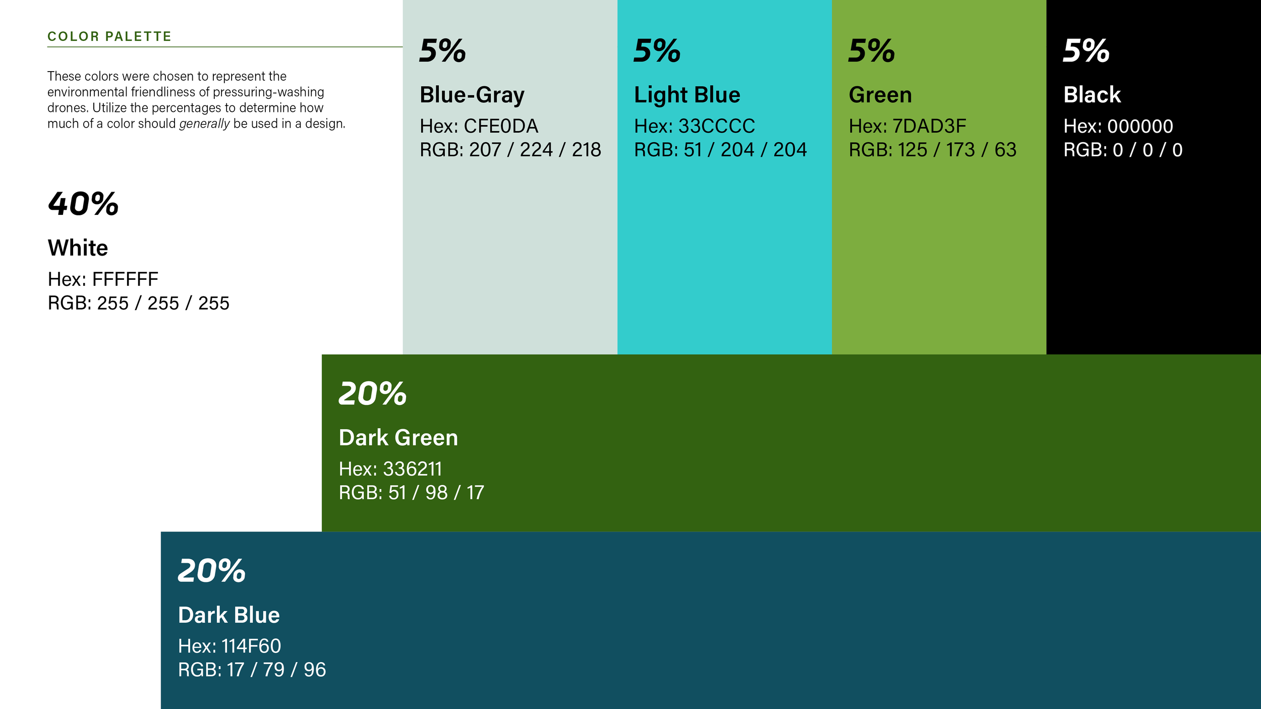
Color Palette
Designing the stationery was where the vision really started to take shape. The invitations featured two layers of linen paper, each one hand-cut (I definitely held my breath for every oval!) and wrapped in a vellum jacket sealed with a wax “O” for their new last name. For the Save the Dates, I went with a rough-textured cardstock and hand-torn edges to create an organic, soft feel. Every color tied back to the bride’s palette, cheerful pastels and bright spring tones that set the tone for the entire celebration.


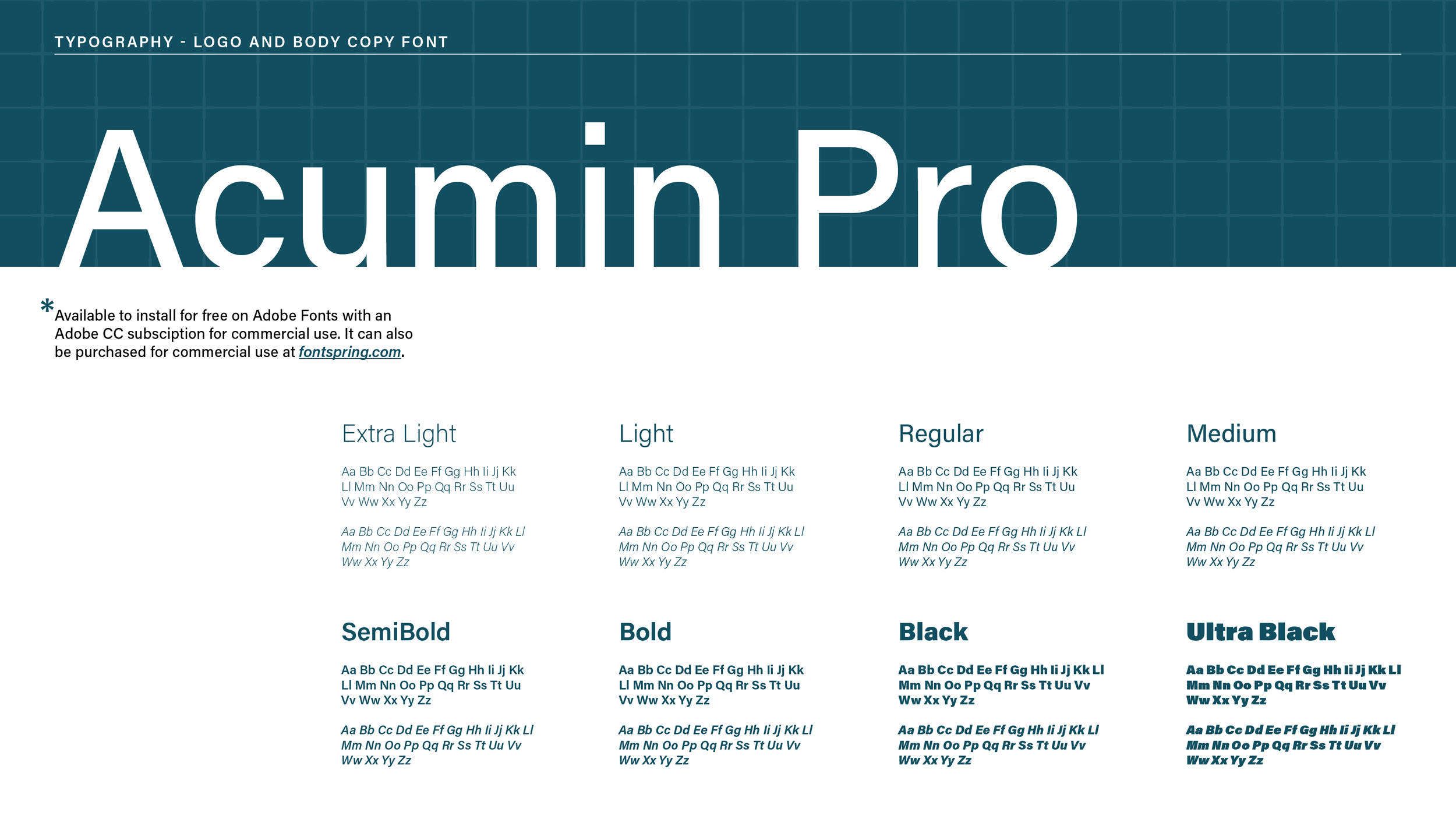
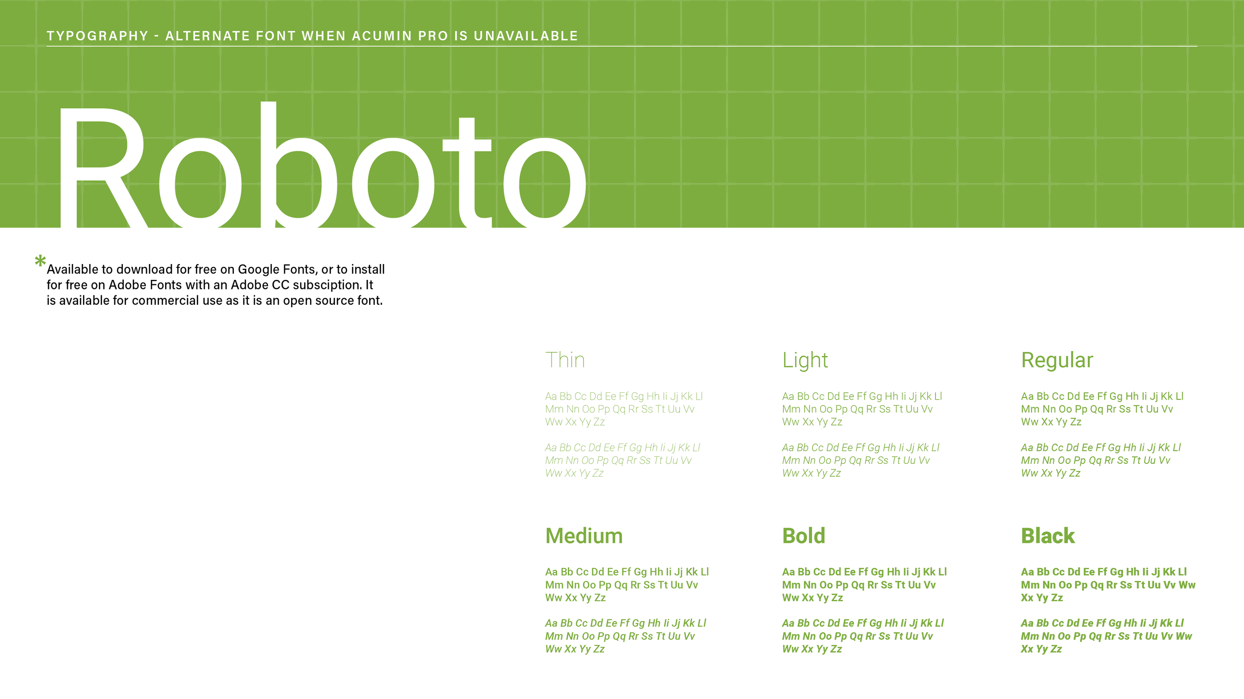
Typography
Designing the stationery was where the vision really started to take shape. The invitations featured two layers of linen paper, each one hand-cut (I definitely held my breath for every oval!) and wrapped in a vellum jacket sealed with a wax “O” for their new last name. For the Save the Dates, I went with a rough-textured cardstock and hand-torn edges to create an organic, soft feel. Every color tied back to the bride’s palette, cheerful pastels and bright spring tones that set the tone for the entire celebration.


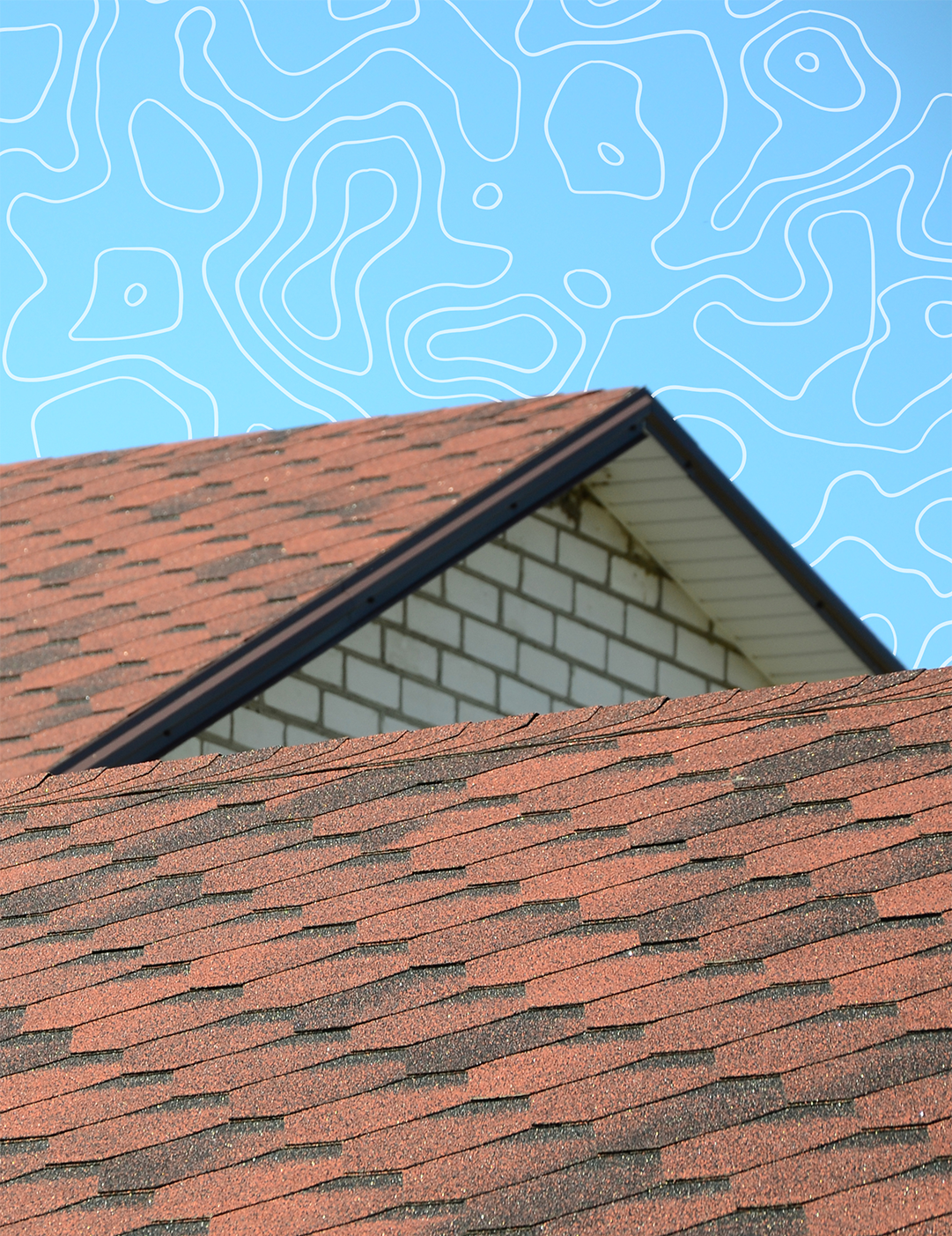
Images and Textures
Designing the stationery was where the vision really started to take shape. The invitations featured two layers of linen paper, each one hand-cut (I definitely held my breath for every oval!) and wrapped in a vellum jacket sealed with a wax “O” for their new last name. For the Save the Dates, I went with a rough-textured cardstock and hand-torn edges to create an organic, soft feel. Every color tied back to the bride’s palette, cheerful pastels and bright spring tones that set the tone for the entire celebration.


Brand Applications

On the wedding day, my focus was on keeping everything cohesive, functional, and beautiful. I designed table numbers, a seating chart, name cards, and a variety of wayfinding and informational signs. Each piece needed to blend with the venue’s décor while being easy for guests to navigate. I used consistent typography, light floral accents, and balanced color to tie everything together. Seeing the designs come to life throughout the space, and watching guests interact with them, was such a rewarding moment.


